Since 2015, Google algorithm updates have factored a site’s mobile responsiveness into the elements determining search engine ranking position (SERP). While this only affects mobile search results and in effect, rewards sites for large text not requiring tapping/zooming and other user interface (UI) elements, all sites will benefit from testing their mobile responsiveness and relaunching with mobile CSS (style sheets) given that mobile visits have finally overtaken desktop and sites continue to see strong growth in site traffic from mobile (smartphone and tablet) devices and browsers.
In order to identify leaders in mobile site design within the travel vertical, we reviewed over 30 destination marketing organization, tour packager and travel supplier/outfitter sites. Based on our analysis, we were able to identify five best practices in mobile site design for travel sites, ensuring an optimal user experience in mobile:
- Understand How Mobile Visitors Differ From Desktop Visitors
One of the most important factors in designing a “mobile-first” and mobile responsive online destination for your brand is understanding how mobile users differ from desktop users. Relevance and context are key here as the same user on a smartphone can be in a very different behavioral mode than what that user might display in a desktop environment.
A research study “A Portrait of Today’s Smartphone User” by the Online Publishers Association and Frank N. Magid Associates revealed that mobile users are more likely to be browsers vs purchasers for example:
Informational Search:
- 5 percent access content/information
- 1 access the Internet
Recreational/Functional Uses:
- 1 percent check email
- 2 percent listen to music
- 46 percent play games
- 15 percent read a book
Utilitarian/Functional Uses:
- 7 percent download and use apps
- Only 15 percent make purchases
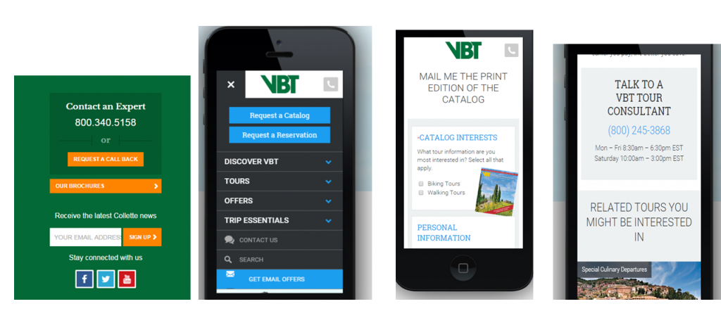
Capturing interest conversions in mobile becomes much more important, therefore, than employing the more typical “book now” orientation. This is particularly true now that many travel reservation systems and e-commerce solutions are not yet mobile responsive.
“Light touch” conversion strategies which only require quick email capture similar to a login are recommended therefore versus what a user might need to provide via a landing page/registration on desktop. And clickable phone numbers or chat features encourage immediate live conversions.
- Carefully Prioritize the Order of Navigation and Content
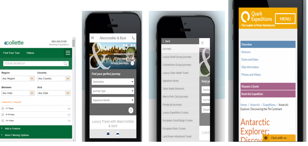
The size of the screen and the fact that most users are time-constrained when beginning a mobile visit also impact mobile responsive design. Critical factors in the mobile user experience become time (speed along tap path), visibility (font size and bite-sized content) and functionality (think “app-like”).
Because of these mobile site requirements, the priority of what elements appear first in the mobile customer journey and how key features like site search and trip finders live in harmony with site navigation are critical decisions. Allowing a trip finder to appear first and then remain “side by side” with main nav elements is one way to allow visitors to navigate in multiple ways easily and quickly in a mobile environment:
- Tap Into the Familiarity, Immediacy and Visual Power of Video, Images, Maps in Mobile
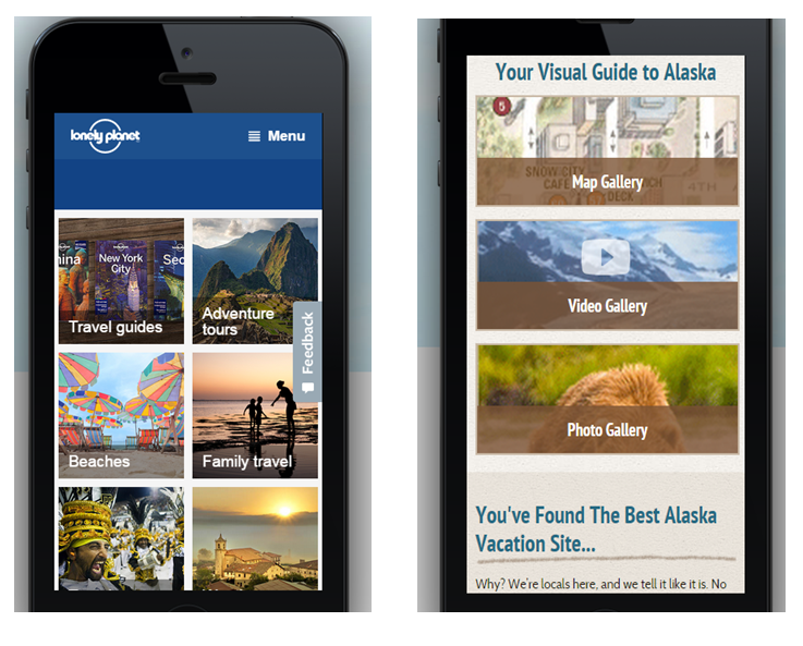
For travel sites, it is particularly important to think through how a mobile visit can help merchandise products visually by helping to seamlessly transport the user directly into the travel experience when they are browsing travel sites on their smartphone. Tapping into the familiarity of users viewing video on their smartphones and tablets leverages existing patterns of mobile user behavior. And video has the unique ability to add experiential elements (audio, real world immediacy) essential to more impactful marketing of a destination or trip experience.
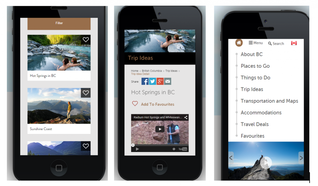
The image to text ratio in the mobile-rendered site is also critical as are mobile versions of slideshows (vs mobile rendition of desktop slideshows). Using images as a short cut for navigation and encouraging visual browsing of galleries also help successfully merchandise destination highlights without bogging down mobile visitors with lengthy text descriptions:
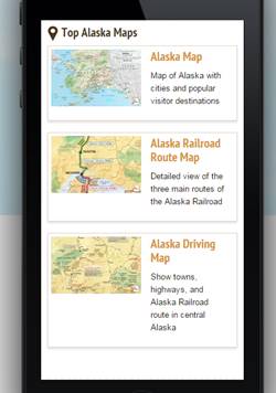
Finally, maps are a fabulous way of quickly communicating an itinerary and allowing a visitor to see points of embarkation and departure for any given tour:
- Encourage Repeat Visits Downstream : Save Favorites
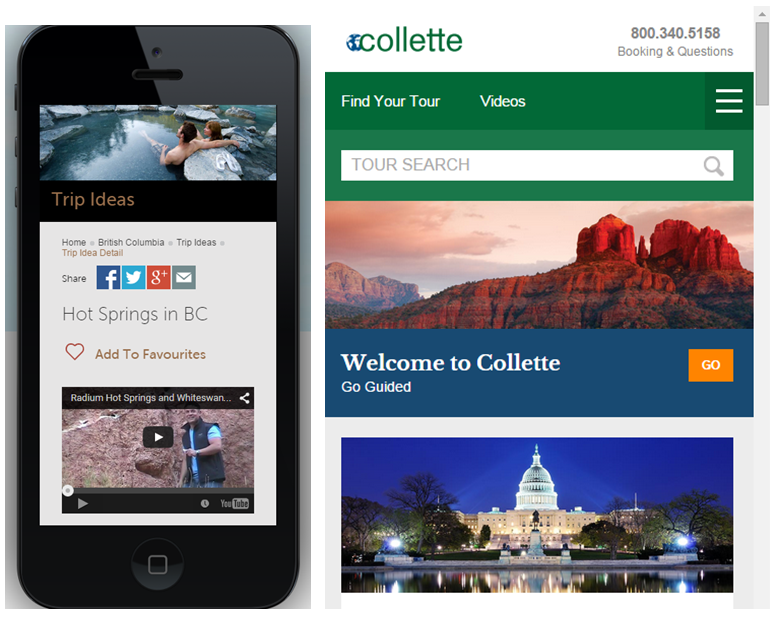
Allowing visitors to “save favorites” is another mobile-responsive feature which encourages time-constrained prospective customers to revisit a site later when a desktop visit might result in a purchase conversion:
- Don’t Disappoint the Mobile Visitor
A final caveat…there is nothing more frustrating to the mobile visitor than suddenly leaving a mobile-responsive environment and landing in a desktop world. Some sites continue to use shortcuts to becoming mobile responsive with their content including creating m.sitex.com mobile subdomain minisites and others who make doorway/main navigation pages responsive (with mobile CSS) but leave other pages non-responsive. This is the definition of user disappointment and the end of a positive user experience. In a world where one glitch (a slow loading site, 404 error link, non-browser compatible content rendition) can forever doom your brand to “never again” on the part of a user, my advice – don’t go there. Making your site fully-mobile responsive to all device screen sizes (because they aren’t going to EVER stop changing), is worth the investment. As Nike says…”just do it”.
Need help relaunching your site in a mobile-responsive world? Call us!


